The Fable 5.2 Design Workflow That Beats AI Slop
Fable 5.2 makes clean websites that still scream "AI made this." Here is the four-step taste, tools, direction, and dial workflow I use to inject real taste and kill generic output.
Want to learn Claude Code?See the Claude Code Masterclass
On this page
Fable 5.2 didn't kill AI slop — it gave it a nicer outfit. The purple-gradient nonsense from 2024 is gone, but the model still defaults to clean, generic, regression-to-the-mean designs that scream "Claude Code made this." The fix isn't a magic prompt or a bigger skill stack. It's a repeatable workflow with four steps — taste, tools, direction, and dial — that lets you drive the model instead of pulling a slot-machine lever and hoping.
I've been building front-end designs this way for client work and my own apps, and the difference is night and day. Below is the exact process, start to finish, using a made-up app called 14 — a tool for finding free, legal dispersed camping spots on public land — as the running example.
What Does AI Slop Actually Look Like in 2026?
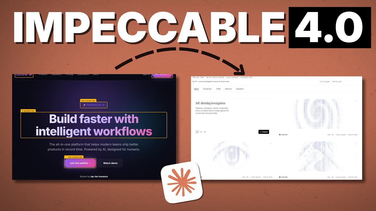
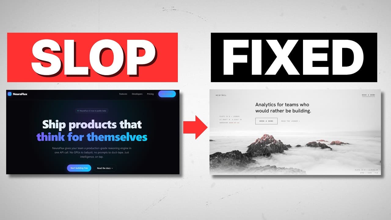
Before you can beat AI slop, you have to recognize it. AI slop is generic, regression-to-the-mean output — the design the model lands on when you give it a plain prompt and no direction. It's not ugly anymore. That's what makes it dangerous.
Run a bare prompt through Fable 5.2 and you'll see the same telltale signs every time:
- The serif headline paired with an italicized accent font at the end of a phrase
- Eyebrows everywhere — tiny labels stuck above or below every section
- The cream background that's become the default "premium" canvas
- Buttons on repeat in the same safe, mildly-rounded style
Here's the thing most people get wrong: swapping the font or deleting the italics doesn't make the design good. Removing slop signals isn't the same as adding taste. Good design is subjective, and you can't fix a lack of direction by shaving off surface-level tics. You have to put taste into the process from the start — which is exactly what step one is for.
Step 1: How Do You Give Claude Taste?
You've heard it a hundred times: AI has no taste. That's true. So the first job is to supply yours. The problem is that articulating why you like something in words is genuinely hard — even designers struggle to put it into language.
So don't. Instead of trying to describe your taste to Claude, go find it and show it. Build a mood board of real websites and designs you like and hand the screenshots to Claude Code directly. A picture carries the aesthetic that a paragraph of adjectives never will.
Where to look for references:
- Pinterest — search broad terms like "SaaS UI design" or "SaaS web design" and save what speaks to you
- Dribbble — try "landing page SaaS" and screenshot the standouts
- Twitter/X — in my experience this is the single best source; follow strong web designers and the good stuff lands in your feed on its own
- Component galleries like 21st — for specific UI patterns
The move is simple: when something makes you stop and go wow, screenshot it and drop it into Claude Code. You don't need a specific aesthetic locked in yet. You're throwing things you like at the wall and nudging the model in the right direction.
If you do a lot of front-end work, take this one step further. I built what I call a taste vault — a web app that holds all my reference screenshots, organized by collection, that Claude Code can read programmatically. Instead of digging through a folder on my computer every time, I point Claude at the vault and it pulls my taste on command. I literally gave Claude Code a pile of screenshots and said, "turn this into a vault of my taste," and it built the whole thing.
Step 2: Which Claude Code Design Skills Should You Actually Use?
Once your references are ready, step two is tooling — the skills and MCPs you load before you start prompting. For front-end work, these fall into two buckets.
Bucket one: general design skills. The two biggest are the taste skill and impeccable. Both work the same way — they've catalogued what counts as AI slop and actively steer Claude away from it across every level of the design process. These aren't micro-skills for one scroll animation; they're all-encompassing guardrails.
Should you use them? Yes, if you're new to front-end design and Claude Code. They're a great crutch and they keep your output from going sloppy. But as you mature, you'll lean on them less and less. The workflow matters more than the skill.
Bucket two: skills that add abilities Claude Code doesn't have natively — mainly image and video generation. For this I rely on the Higgsfield MCP, which hands Claude access to essentially every AI image and video generator out there. Adding real generated imagery to a page gives it a premium feel that flat layouts can't match.
To set it up: go to Higgsfield.ai, open the MCP section, and hit Add Higgsfield to Claude. In the Claude desktop app, copy the MCP link, go to Customize → Connectors → Add custom connector, paste it in, name it whatever you want, and continue. You'll need an existing Higgsfield account, and it walks you through authentication from there. Once connected, Claude can call any image or video generator it needs.
One warning, and it's the most important part of this step: don't bloat your stack with skills. You are not one skill away from good output. As these models get better, piling on ten thousand front-end skills actively hurts you. When you're unsure whether to use impeccable, the taste skill, or plain Claude Code, just ask Claude to generate the page both with and without the skill and compare. You'll see the difference for yourself instead of guessing.
Step 3: How Do You Pick a Design Direction Without a Design Background?
Steps one and two are setup. Step three — direction — is where you start prompting and settle into an aesthetic. This is the part that paralyzes people who don't come from design. Where do you even start?
You don't have to know the answer. Have Claude generate several distinct directions and react to what you see. Most of us are visual — we have to look at something before we know if we like it.
Here's the actual prompt structure I used for 14:
I'm building a landing page for 14, an app that finds free, legal
dispersed camping spots on public land. Take a look at the references
I've attached for the type of aesthetic I like. Keep those references
in mind and come up with three landing pages for this app. Make them
three very distinct takes. You can generate images with Higgsfield if
you deem appropriate.
You can read the breakdown: explain the app, attach your references, and ask for three very different takes. Giving the model permission to generate images with Higgsfield where it fits means the mockups come back with real visuals, not gray placeholder boxes. Like so much of working with Claude, you don't need the answers to the test up front — you ask Claude what it thinks is best and let it surface options.
For 14, Fable 5.2 came back with three landing pages side by side:
- Survey — interactive hero elements you can adjust in place, plus a cool image slider further down the page
- Diorama — a claymation-style look with genuine character (think those stop-motion Airbnb spots), interactive on/off toggles, and the most personality of the three
- Almanac — extremely clean, almost too clean, which made it feel a little lifeless
The point isn't which one I picked (I went with the diorama for its character, despite a few rough edges like an image bleeding over the early-access bar and a green-on-green color choice I wasn't sure about). The point is that seeing three distinct takes side by side is how you discover your direction when you can't name it in advance.
From here you have a fork. You can keep iterating at the macro level — "I like number two, now give me three different versions of the diorama" — and drill down direction by direction. Or you can lock the diorama and move to the final step: dialing it in.
Step 4: What Is a Tweak Bar and Why Does It Change Everything?
Step four — dial — is about micro-adjustments. And this is where most people fall into a trap: you land on a direction, then start firing off one prompt to fix the color, another to tweak a font, another to adjust a shadow. You become the bottleneck, hand-writing a prompt for every tiny change.
The fix is a tweak bar — the same kind of live control panel you see in tools like Claude Design, except you can build your own and take it to the extreme just by prompting for it. Here's roughly what I asked for:
Move forward with the diorama option, but I want to see more
adjustments. Create a tweak bar with sliders and toggles that can
change things on the page — fonts, motion, how elements animate in,
shadows. Get very deep with the number of controls. I want to iterate
over and over. Even things you think I wouldn't change, throw them on
there. Surprise me. Then bring it up when you're done.
Claude came back with a tweak bar holding 101 controls — and it fixed a few issues on its own along the way, like that early-access bar overlap. A sampling of what it exposed:
- A "surprise me" button that randomizes everything at once (yes, this is a slot machine — but now it's one tool among many, not your whole process)
- Palette presets — sage, desert, lakeside, wildflower, dusk
- Background texture and hero size/position, so you can pull the hero toward the headline or tilt it
- Seasonal hue shifts to push the whole scene toward fall, applied across all the clay art
- Pin style — ring, dot, or teardrop
- Motion controls — replay animations on scroll-back, tune the bounce-in
You could spend twenty minutes in a bar like this hitting every change you'd ever want, in seconds each, instead of writing a prompt per tweak. The tweak bar is what turns Fable 5.2 from a slot machine into the engine of a car you're actually driving. It's the last mile between a generic output and one that reflects your taste.
Why This Workflow Beats Chasing the Perfect Prompt
The reason this works isn't any single step — it's the sequence. Taste gives the model your references so it isn't starting from zero. Tools load the right (and only the right) skills. Direction lets you find an aesthetic by reacting instead of describing. Dial gives you a fast, tactile way to iterate to the finish.
One prompt was never going to beat AI slop. A sustainable, repeatable process does. You can apply this exact framework to any web design idea you have — the app changes, the four steps don't.
Frequently Asked Questions
Does Fable 5.2 eliminate AI slop on its own?
No. Fable 5.2 produces much cleaner output than earlier models, but with a plain prompt it still defaults to generic, regression-to-the-mean designs — serif headlines, eyebrow labels, cream backgrounds. Beating slop takes a workflow that injects your taste, not a single better model.
What's the easiest way to give Claude Code my design taste?
Show it, don't describe it. Collect screenshots of websites and designs you like from Pinterest, Dribbble, or Twitter/X and hand them to Claude Code as references. Articulating taste in words is hard; a mood board communicates it instantly. For heavy users, building a "taste vault" web app lets Claude read your references programmatically.
Should I use the taste skill or impeccable for front-end design?
Both are large, all-encompassing skills that steer Claude away from AI slop, and either is a strong choice if you're new to front-end design and Claude Code. As you get more experienced you'll need them less. When unsure, have Claude generate the page both with and without the skill and compare the results directly.
How do I pick a design direction if I'm not a designer?
Don't try to pick blind. Prompt Claude to generate three very distinct landing pages from your references, then react to what you see. Most people need to look at options before they know what they like, so let the model surface several directions and choose from there.
What is a tweak bar in Claude Code?
A tweak bar is a live panel of sliders and toggles — for palette, fonts, motion, shadows, and more — that you prompt Claude to build directly into your page. Instead of writing a separate prompt for every small change, you adjust controls in real time and iterate in seconds. In this example Claude generated a bar with 101 controls.
If you want to go deeper into front-end design with Claude Code, join the free Chase AI community for templates, prompts, and live breakdowns. And if you're serious about building with AI, check out the paid community, Chase AI+, for hands-on guidance on how to make money with AI.
Topicsclaude-codefable-5.2ai-designfront-end-designai-slopweb-design